
How to create a unique visual identity
8 steps to building a visual world with Lucas Crespo

Visuals have always been a big part of how we think, communicate, and build. But most AI visuals feel generic because we don’t know how to communicate the texture of our imagination, and so we tend to start at the end: “make me a cool logo,” “make me a brand identity,” “make this look premium.”
This guide, adapted from a Sublime Session with Lucas Crespo, designer at OpenAI and formerly Head of Design at Every, is for brands, small businesses, and creators who want a more distinct and cohesive visual identity.
In the session, Lucas used a hypothetical product called “Instead of Doomscrolling” (an antidote to mindless scrolling built around digital gardens, intentional browsing, curiosity, and wandering with purpose, h/t Mapu) to show how he turned a messy collection of inspiration into a visual world with a point of view.
Enjoy ;)
Note: Sublime Sessions are free for Premium+ members. Upgrade to access the full archive of past sessions--including recordings and materials--with Emmett Shine on how to teach machines your taste, Zara Zhang on code as a medium for storytelling, Carly Valancy on how to write an unignorable email, and more. This week only, you can use code INSTEADOFDOOMSCROLLING for 20% off.
Step 1: Gather references
Start wide. Lucas began by collecting references in a Sublime collection (he made it collaborative and we added some references too).

He laid the references out on a Sublime Canvas along with some insight on the project for a spatial macro view.
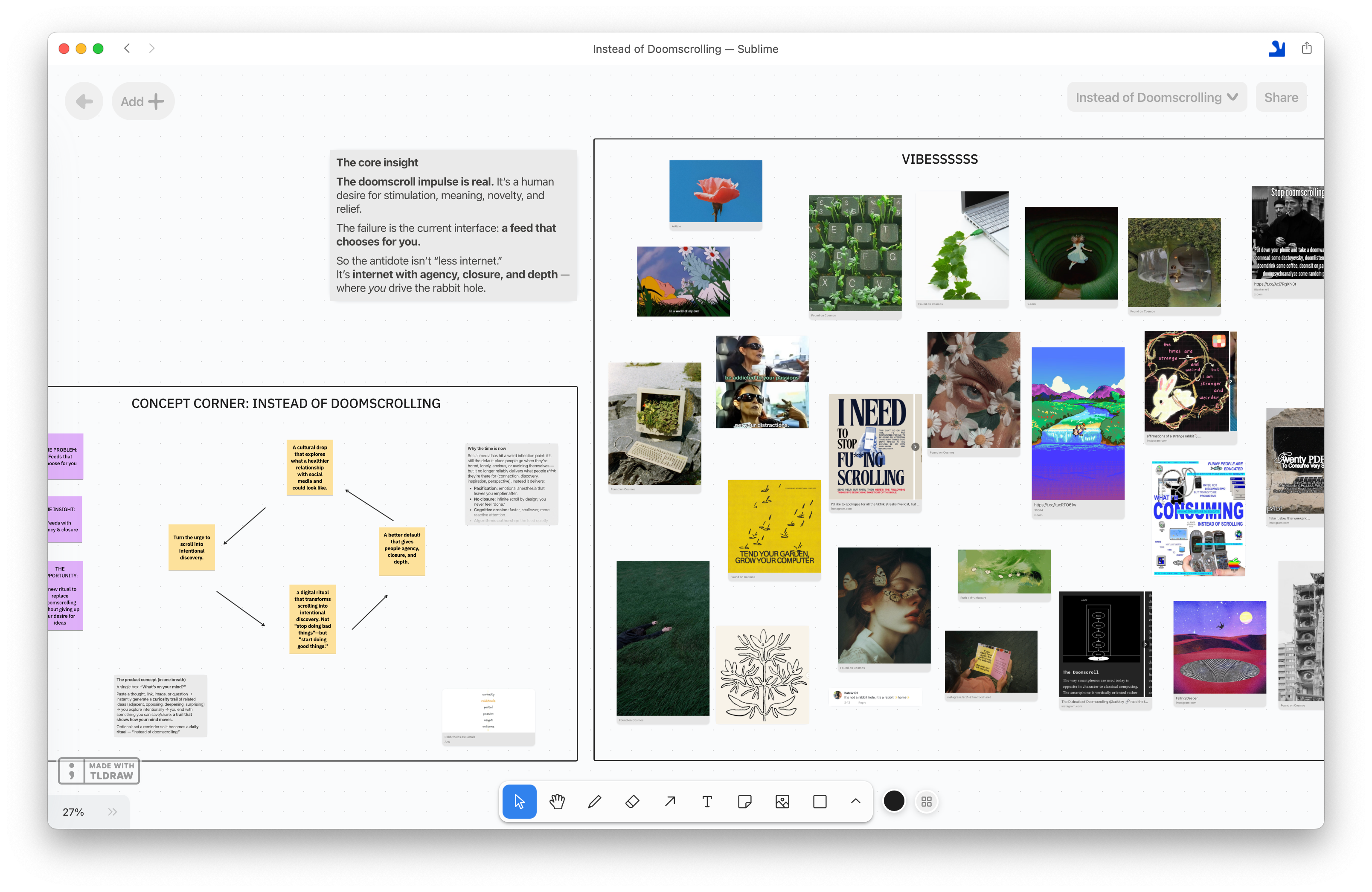
Your job at this stage is to capture what you’re drawn to before you know why — the references do not need to make sense. They just needed to carry some kind of signal.
✴︎ Sublime is especially useful in this step because good reference-gathering rarely happens in one sitting. Create a Sublime collection for the project and save anything from the browser extension, the iOS app while you’re on the go, or things you discover inside Sublime. ✴︎
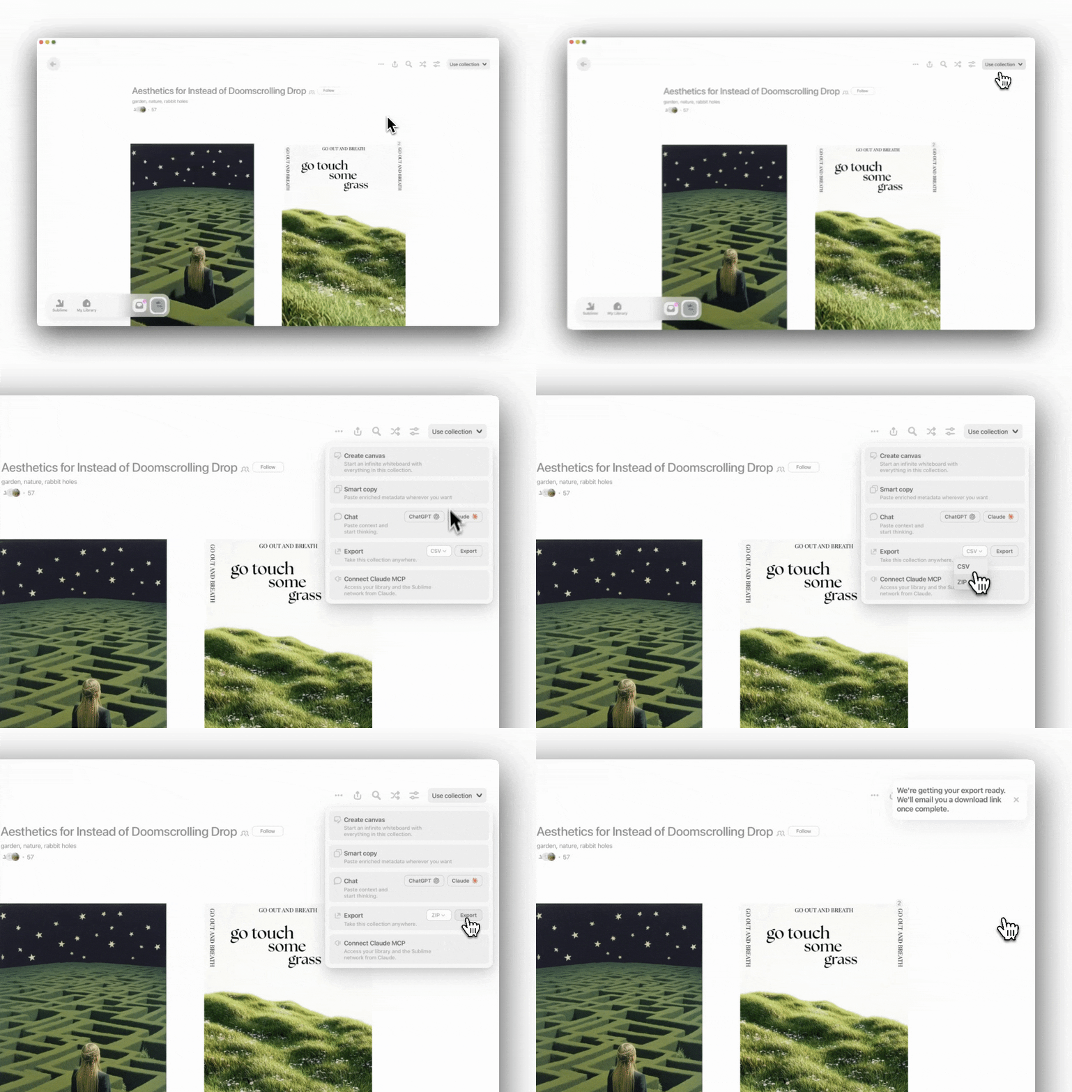
Step 2: Export your references
Lucas then exported the Sublime collection as a ZIP file to his computer.
This folder became the raw material to work with Claude (see step 3).
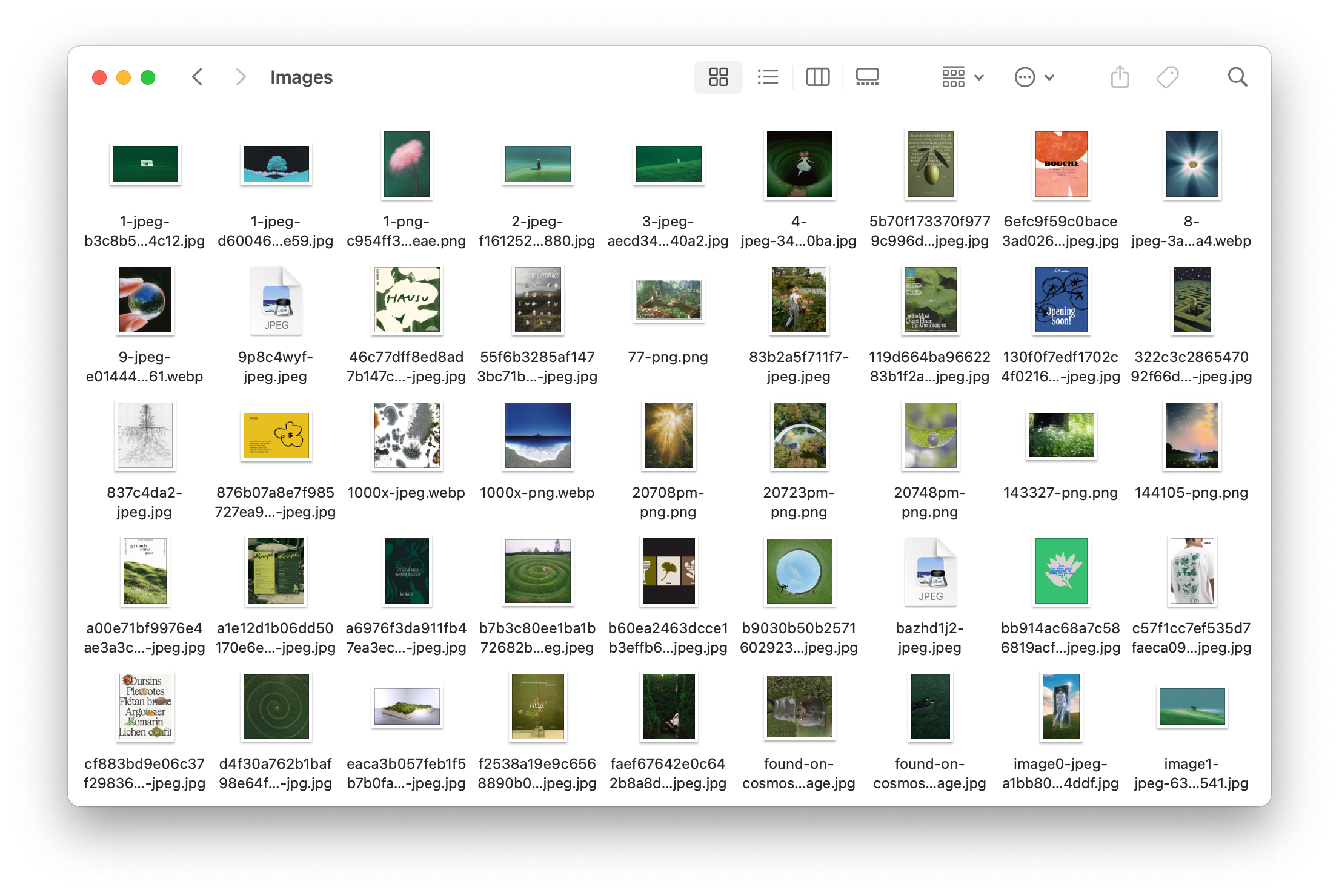
Step 3: Give Claude access to the reference folder
Lucas used Claude Cowork to work directly with files and folders in his computer.
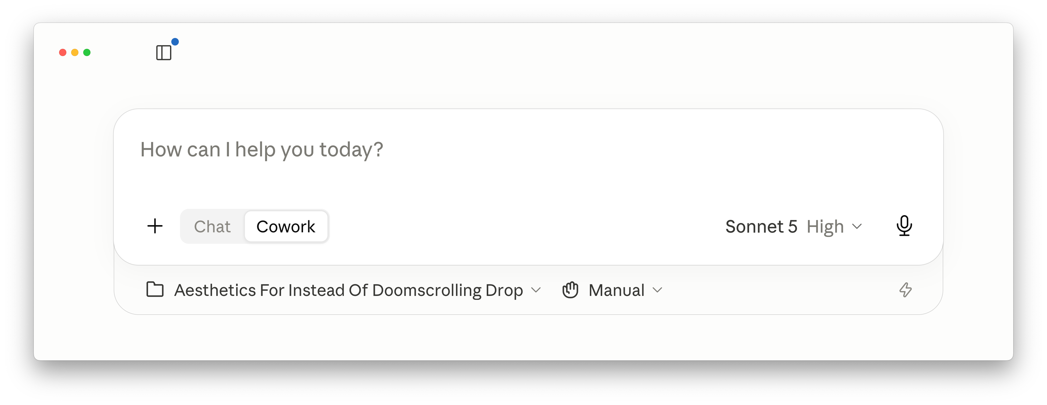
Instead of pasting images one by one into a chat, he pointed Claude to the folder of references he exported from Sublime.
From there, Claude could look through the images, describe what was inside them, create new folders, and group references by visual direction.
Step 4: Ask Claude to analyze the material
Once you’ve exported your Sublime collection and pointed Claude to the folder on your computer, ask it to help you understand what you’ve collected.
This step gives you the vocabulary you’ll use later in Midjourney, Nano Banana or anywhere else you generate visuals.
Lucas used Monologue, a dictation tool, to ramble context into Claude.
Here’s the prompt he used:
Hey, co-work, I am developing a brand identity for instead of doomscrolling. I have attached a screenshot of the general thinking around the project and what we’re trying to achieve with it, and it’s basically a product or experience that’s supposed to be the antidote to the mindless scrolling. Think about digital gardens, intentional browsing, and curiosity over consumption.
I have a folder of references that I attached here that you have access to, called references, and basically, I want you to go through it. All of these images are super raw right now. I haven’t organized them yet at all. They represent vibes, textures, feelings, visual directions that are all over the place, and I really like them, I’m really drawn to them, but I can’t yet articulate why. what I need your help with right now, is specifically to help me make sense of all of this material, and help me develop some sort of visual language around it.
Let’s go step by step. The first thing that I want you to do is to review all of the images in this folder. for each one make a note about what it is, what each individual one is contributing, what are the vibes and moods of each one, like the color palettes, let’s just try to start categorizing things and, like, starting to make sense of what’s inside of this specific folder. Everything from texture, materials, layout, compositions, typography, colors, etc. any specific details that we might want to preserve, what we don’t, etc. Just go through all of that, and help me describe what’s in all of these images. And then, after we are done with that, we’ll jump into the next step. But for now, let’s just do that.
This is the first big unlock: AI can help turn visual instinct into very precise language.
Claude reviewed the folder and began creating a visual analysis.
Step 5: Ask Claude to group the references into visual directions and pick one
Once Claude had analyzed every image, Lucas asked it to group the references into distinct visual directions.
This is the prompt he used:
After reviewing all of the images I want you to group them into folders of different, visual directions. So, again. I would just want you to identify the distinct visual directions hiding in this collection. These references are all probably pointing in different ways, so your job is to categorize them into two to three different brands, quote-unquote, that could emerge from all of this material. And for each direction we identify, let’s give that grouping, or new folder that we create, a working name, something that’s evocative and not generic, and let’s include all of those images in there, if possible, and then I want you to reply here in the chat, what folders did you make, and why are they different, and And we can go from there. But please, be opinionated. I want to see patterns that I might be too close to see myself.
Claude identified three themes:
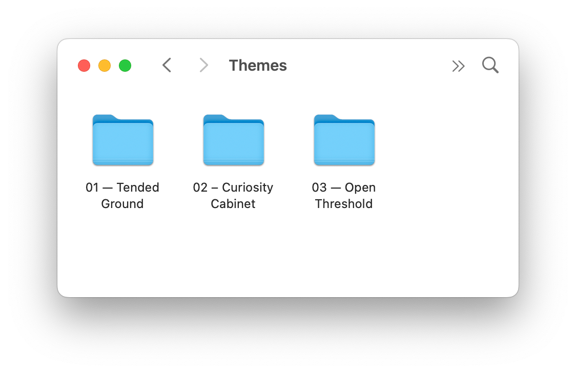
This is where the creative director comes back in.
Claude surfaced options and explained them in detail. Lucas still had to choose the one that feels right. He picked #3, Open Threshold. See this process in action in the video below:
Step 6: Build a brand language around the chosen direction
Once you pick a direction, ask Claude to go deeper.
Here’s the prompt Lucas used:
I want to go deeper into the threshold direction, and I want you to help me build out a brand language for this direction. Think like an art director that is developing a campaign brief. Not a product designer, you’re not the designer yet, you’re just the creative director here, and your job right right now, is to… help me think about the words and the feelings around this. So, let’s cover things like the feeling, like, what types of emotions should someone have when they encounter this brand, for example? What type of place or world are we building? What would it look like? What would it feel like?
The more specific, the better. Like, be specific and weird. I think it’s important that we don’t go generic here. Also, like, in terms of vocabulary, what types of words should we be using when we’re talking about textures, when we’re talking about materials, when we’re talking about lighting, color temperatures, what belongs here and what doesn’t belong here? Also, in terms of typography, what kinds of, typographic approaches would make sense here, what type of typographic approaches we should totally stay away from, and what’s the personality of the letter forms that we should be looking at for this.
And then finally, let’s also try to think about, like, two or three images inside of this specific folder, this direction, number 3, that are sort of like the North Star for this direction, so let’s pick maybe 2 or 3 protagonists inside of this folder.
Claude then produced a brand language brief with feelings, vocabulary, typography, and what to avoid. The language is pretty cool, see a sneak peek below:
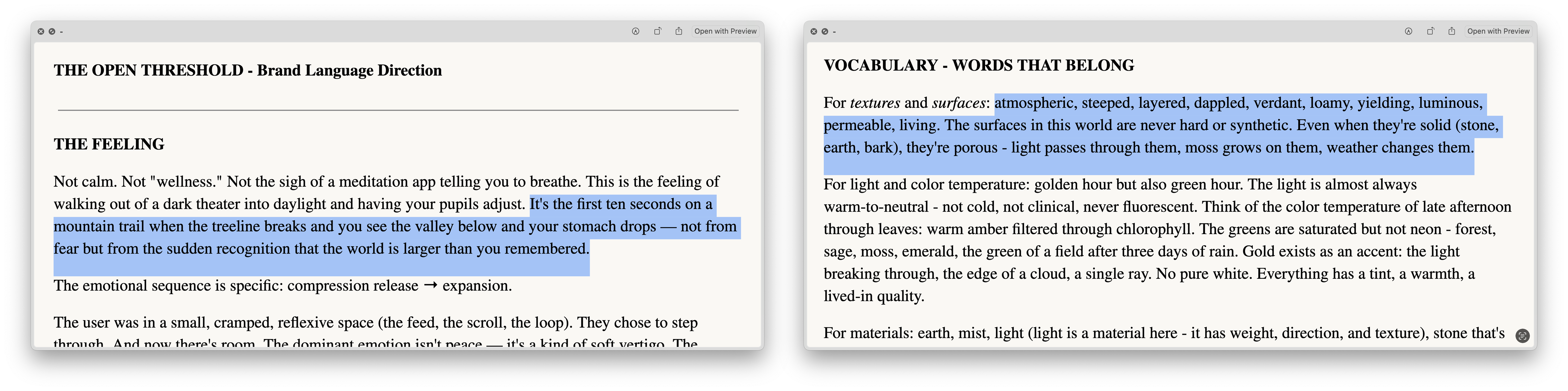
Step 7: Turn the brand language into image prompts for Midjourney
After Claude creates the brand language, ask it to write short prompts for image generation.
The key is to avoid asking for final brand assets. Instead ask for prompts that generate scenes, textures, moods, and images that belong to this world.
Here’s the prompt Lucas used:
Based on this specific direction and all the context that you have already, I want you to help me craft some very, very simple prompts, that I can throw into Midjourney, or into Nano Banana, or whatever image model, it doesn’t really matter right now. And I want prompts that will help me start generating brand imagery for this specific product. So this should not be prompts around, like, hey, create a logo, create a brand identity, or create generic prompts. They should be evocative of the feelings, meaning things like the scene, the texture, the moments that capture the brand’s feeling, specific around lighting, texture, temperatures, all that sort of stuff, and format each prompt in its simplest way, and keep each prompt between maximum 15 words..
Here’s what Claude came back with. The prompts are intentionally simple because the heavy lifting is coming from the references and the moodboard.
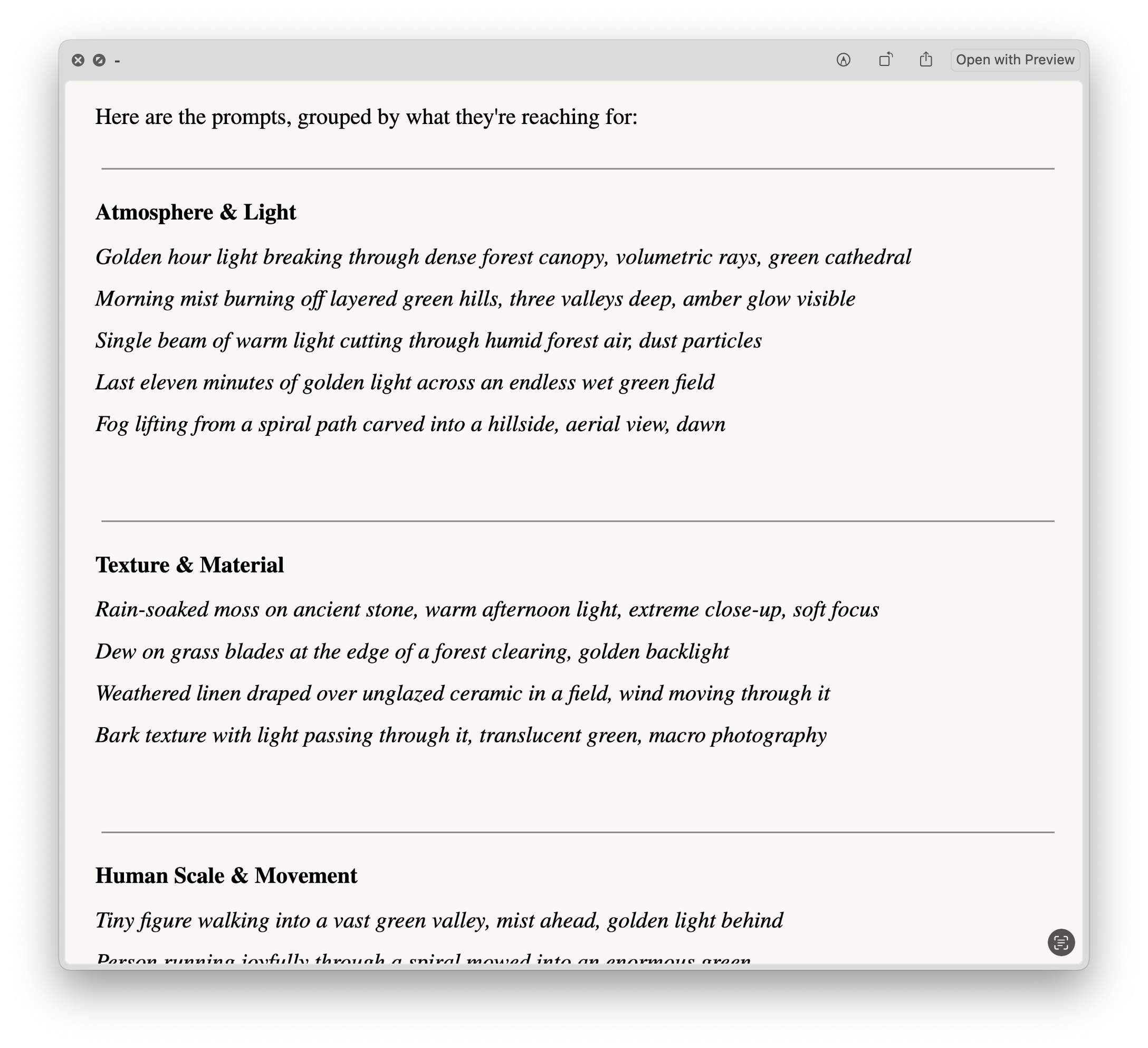
Step 8: Build a Midjourney moodboard
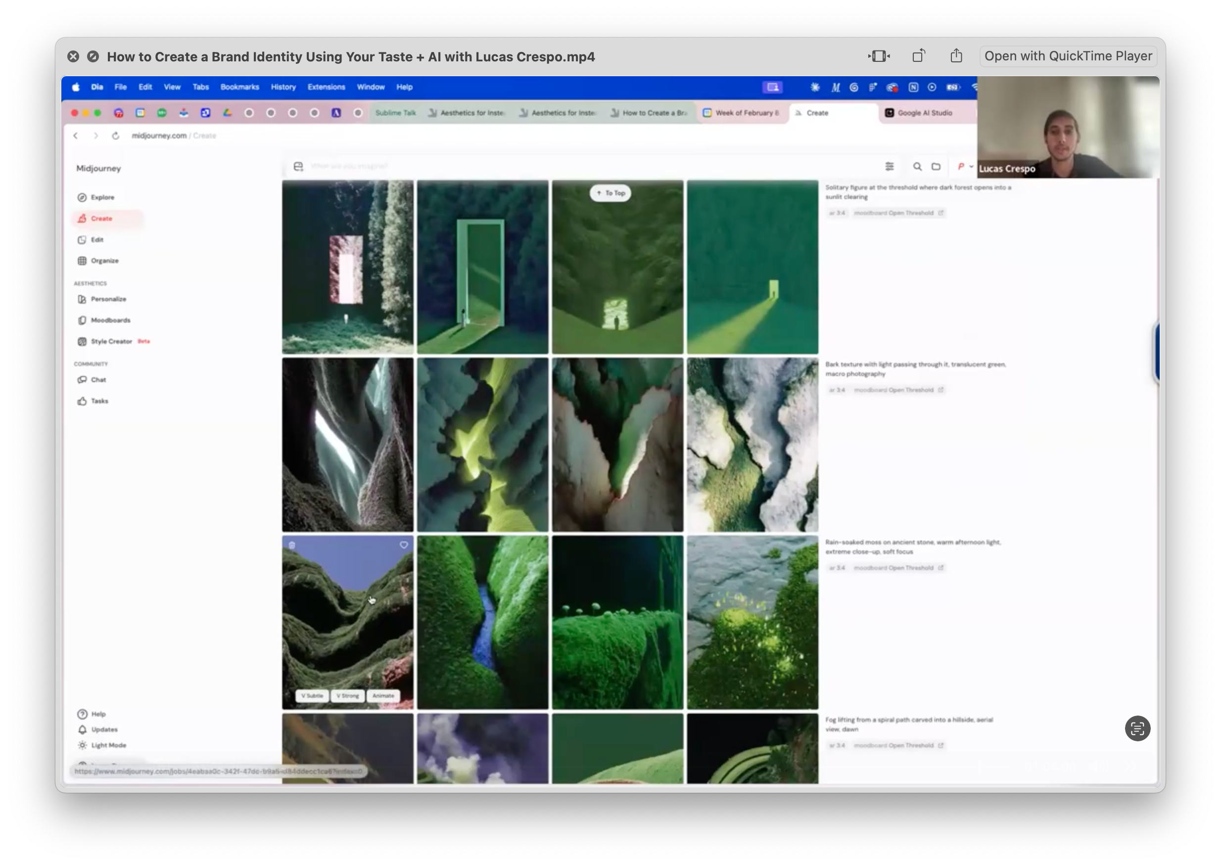
Now with the chosen direction and some prompt directions, Lucas went into Midjourney Moodboards to create a moodboard using only the images from the chosen direction: Open Threshold.
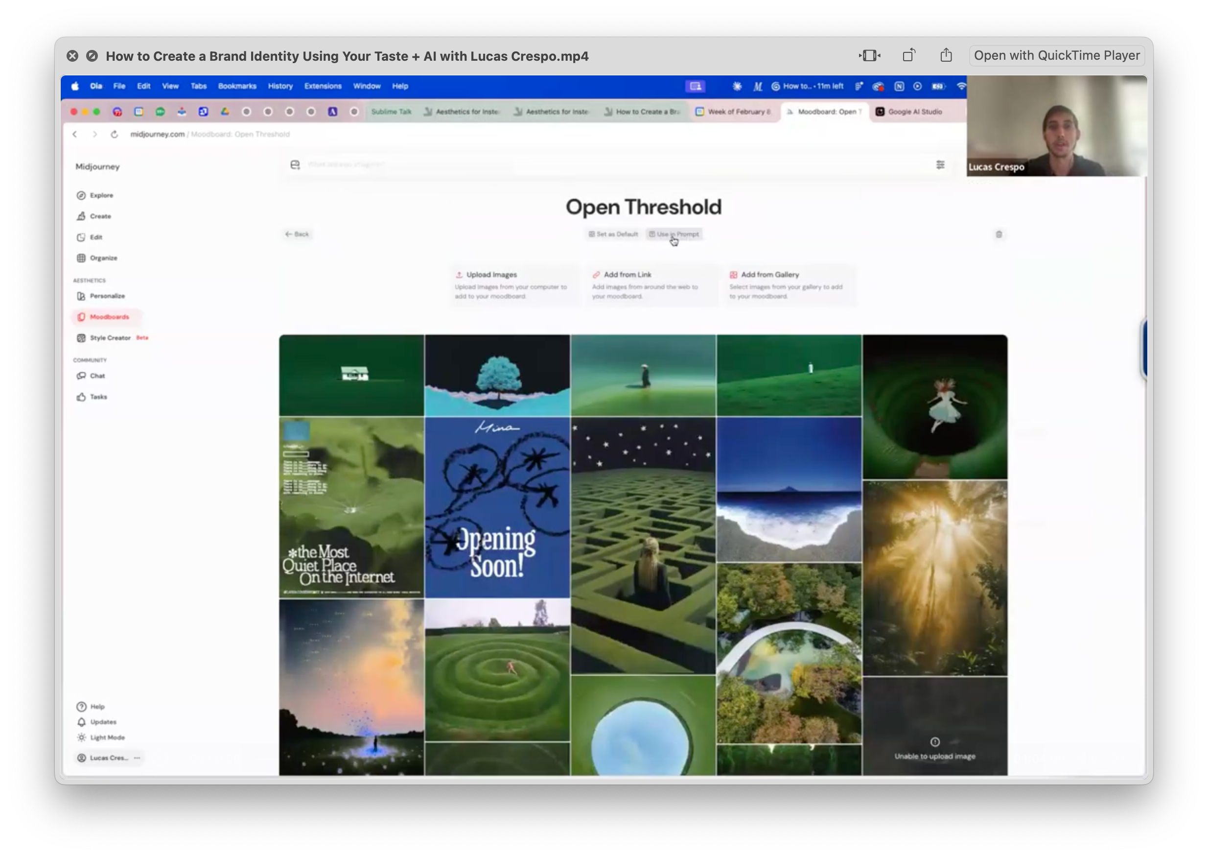
If he had chosen every image from the original reference dump, the output would have been scattered.
Then, Lucas tested the prompts against the moodboard by clicking the “use in prompt” button in the Midjourney moodboard page. Because the moodboard already contained the visual DNA, even simple prompts started producing images that felt like they came from the same world.
This is where the process starts to compound. When Midjourney creates something you like, save it. Add it back into the moodboard, and let the moodboard become more specific over time.
And voila, this is how you go from a scattered collection of references to a coherent aesthetic.
Once the aesthetic world is defined, designing logos, interface details, launch assets, and campaign imagery gets easier.
Lucas’ lessons for making non-generic AI visuals
1. Vague words make vague work.
“Calm,” “cool,” “premium,” and “organic” mean different things to different people. The art director’s job is to turn subjective taste into specific language the model can actually use.
2. Prompt the inputs, not the output.
Don’t start with “make me a cool logo.” Start with: “Here are my references, constraints, visual language, etc... Help me think.” The model’s default taste is generic. Your references are what give it specificity, texture, contradiction, and point of view.
Below the paywall, five more lessons, the full recording of the session, and a list of the tools Lucas used.