In all things, there's the thing, and then there's the thing beneath the thing.
What it’s about, and what it’s really about.
Take the movie Jaws.
Jaws is about a shark terrorizing a beach town, but it’s really about the universal fears that lurk beneath the calm: the dread of the unknown, the fragility of safety, and the lengths we go to face—or avoid—our deepest anxieties.
So too with logos.
A logo is an apple, a swoosh, arches.
But it’s really innovation (Apple), achievement (Nike), and nostalgia (McDonalds).
Here is the story of Sublime’s logo—what it’s about and what it’s really about.
It’s 2022 and Sublime is in early development.
Sari and Gabriel have sunset their last project, Startupy, and yearn to build something different.
They bring on a genius artist named Yanis to revamp the interface.
They come up with the name Sublime (another good story, for another good time).
But what about the logo?
They need help, but from who?
Options abound, including of course the right choice, the safe choice, the giant agency that every hyped startup is using. Red Antler or whichever is en vogue.
The pull of the safe and the vetted is magnetic, but Gabriel, Sari, and Yanis want something different. They want to free themselves of the cookie-cutter SF/Dublin tech-bubble monotony of drab, brave new world sameness.
So, they create a list of agreements to guide their search.
A compass.
A code of creation.
Great in theory, but where do you actually find people who fit the bill?
Gabriel tells me this story over a video call. He’s been folding laundry on the other side of the room, but for this part he comes close to the camera.
He’s got this habit, he tells me, that whenever he sees something beautifully designed in Madrid, like a menu in a coffee shop, or the interior design of a pop-up store, he’ll ask who designed it. Some people look at him and go “huh?” but some people answer.
And the answer is always the same:
“Bate”
”Bate”
”Bate”
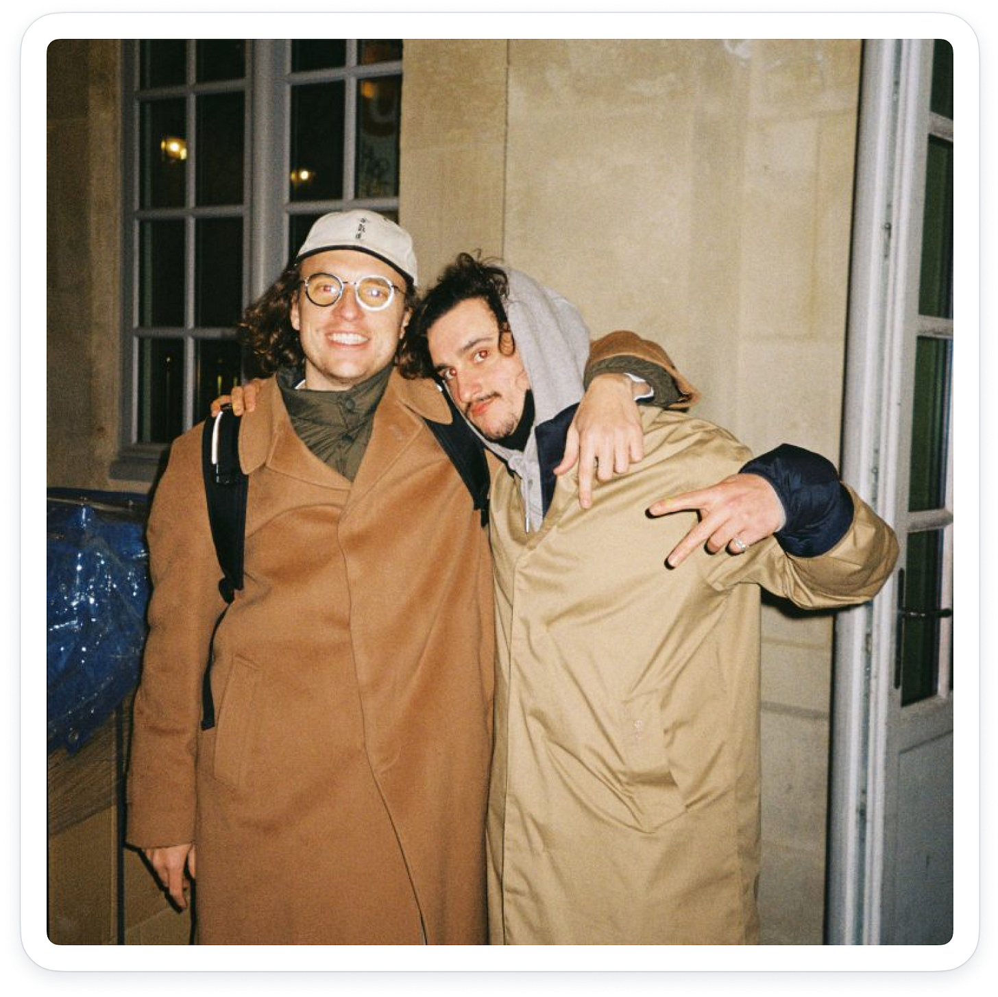
Bate is Jose and Álvaro—two architects and designers who run a little agency in Madrid.
Bate’s portfolio stretches beyond Madrid. Gabriel finds their work in Tel Aviv at a coffee shop in the middle of Shuk Hacarmel.
!! The hell?
How?
Bate.
When the universe speaks… Listen.
And listen Gabriel did.
When I asked Álvaro why he thought they were chosen for this project, he said, and I quote; “I don't really know why. We’re architects.“
“Exactly,” Gabriel told me. “It felt really safe to me. The riskier choice was playing it safe.”
Bate’s process always starts by creating a strong connection with the client. They ask a lot of questions and develop what they call “the recipe.”
An expanded code of creation.
From there, they draw inspiration from unusual places: the human body, hand scribbled doodles, brain-computer interfaces, chromosomes, unpredictable human-created paths, neurons, train tickets, a tree trunk,…
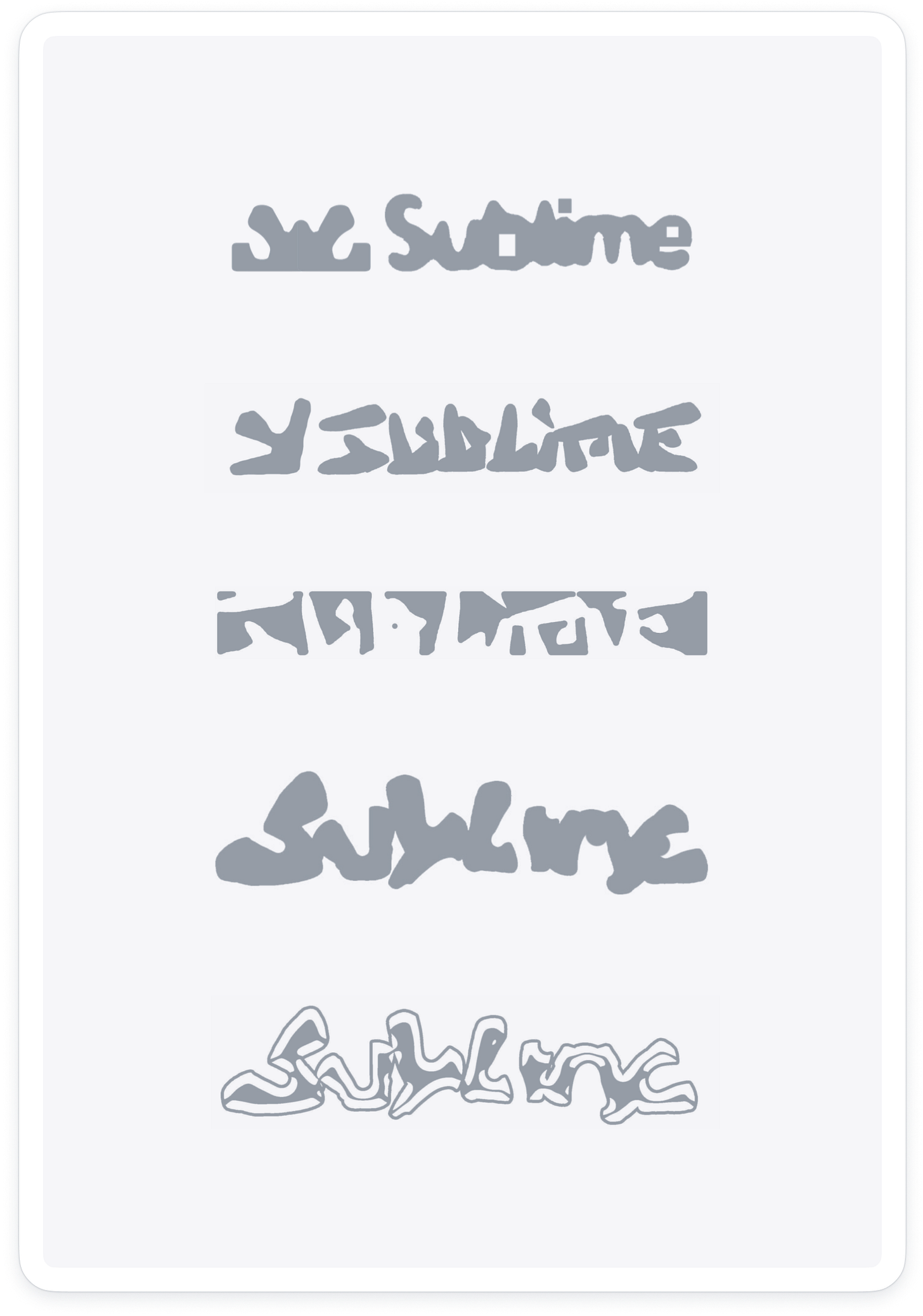
They then focus on a series of delicate transformations of Sublime’s letter S.
Gabriel and Sari wonder if it can really be that simple? That obvious… Just play with repetition and the letter `S`?
…Bate plays on…
…simplicity reigns supreme…
…warmer…
…hotter…
…fire.
…and like that, after five rounds of back-and-forth, Sublime’s logo is born.
Like a person, it can dress up.
It has moods.
It has a spine.
It has style.
But it doesn’t take itself too seriously.
It reacts to how it’s feeling.
It adapts to its environment.
It embraces change.
That’s the story of Sublime’s logo.
But what’s it really about?
The thing beneath the thing is the process.
The process of humans coming together.
Sharing ideas outside of the cookie-cutter norm.
And making something beautiful.
Because that’s what humans do.
The process is the point.
Because it is only through the process
that a squishy little grey blob
can become
something sublime.
****
P.S. If you’re a Sublime Premium member and you want to see Bate’s original presentation with more design explorations, reply to this email and we’ll send it to you :)


Now I know why I couldn't figure out what the hell that logo wanted to convey. I didn't identify with it, and neither I did with the brand name which sounded so self-oriented and presumptuous.
But I was tuning the dial in the wrong direction.
It's the logo that speaks to the brand and says:
"Any squishy insignificant little gray blob can become something sublime, when seen through your inspired and insightful eyes."
This post reminds me of a favorite quote from Sol LeWitt - “The idea becomes a machine that makes the art”